It can be easy to try and spring for bright colours, especially when we’re creeping closer to the darker months. We get it! However, not every room needs a pastel – in fact, we think that with just the right touch, a few splashes of stygian can make a home come alive.
Join us as we go over some of our favourite ways to use these often-ignored dramatic shades! We’ll also be showing you some of our favourite Bloor homeowners who put this into practice, so get out your fluffy dressing gowns and glasses of scotch, it’s time to get dark and sophisticated.
Paint for the room, not for the paint.
It’s good design practice to look at a room’s potential, rather than your personal ideal. Designers such as Christopher Leach, for example, lunge for deep and dramatic shades. They recommend doing this if a room doesn’t get a lot of natural light, or if a room is devoid of appealing visual features that would make a white wall look bland.
It can be hard to give up on a colour scheme, but colour is ultimately dependent on light, and what looks good in one room might feel drab in another! Don’t limit the variety in your household, and create warm and cradling atmospheres to unwind in where you can.
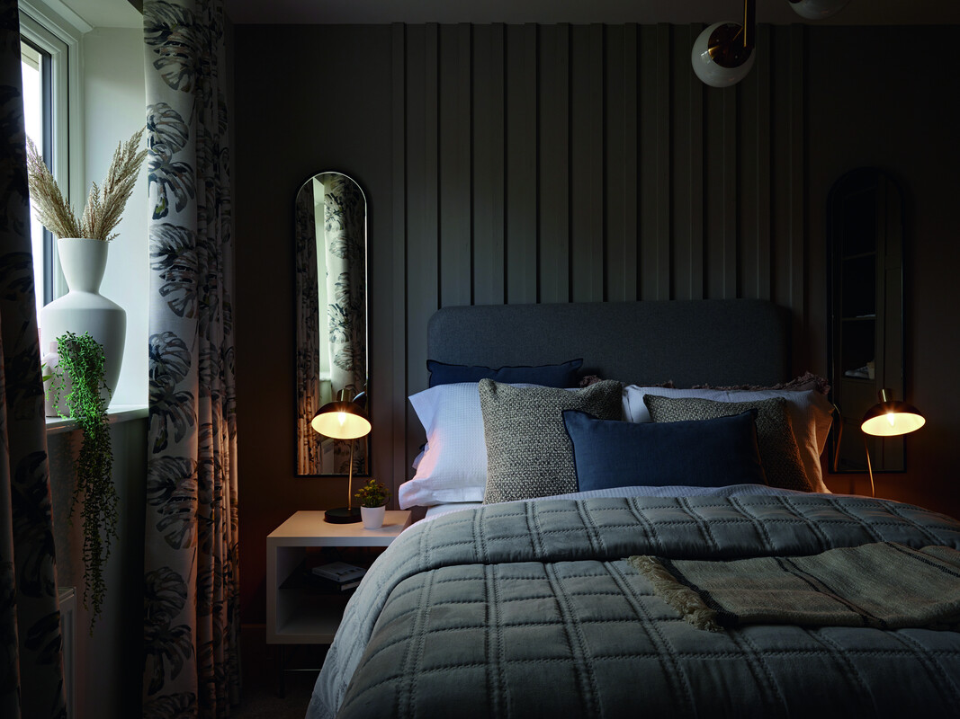
Invert Your Colours
We’ll sometimes instinctually decide on a bright shade for the walls and a dark shade for the floor. But what if you inverted that scheme? If you’d like a white or a cream carpet, consider lavishing your walls with a navy or charcoal to give it that pop of contrast. Choose right, and it’ll feel like you’re walking on cloud nine, with light streaming in to create a lifting mood under your feet!
You can also do this with furniture. If your walls have light colours, experiment with deep pops of shade in your chairs and tables. Alternatively, if your walls are dark, highlight centrepieces with monochromatic counterpoints to lead the eye!
Consider the Décor
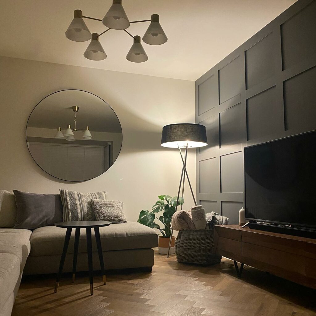
It can be tough to plan ahead, but you should consider what kind of furnishings you’re putting into your room. Do you have bright furniture that would vie for attention with noisy wallpaper? Consider remedying this with dark colours to give the eye a rest. Have a piece of art you just adore with a white canvas? Give it a stygian backdrop to really let it shine.
Ultimately, dark colours can make the brighter parts of your décor look even lovelier. In this case, comparison is the birth of joy, not the death of it!
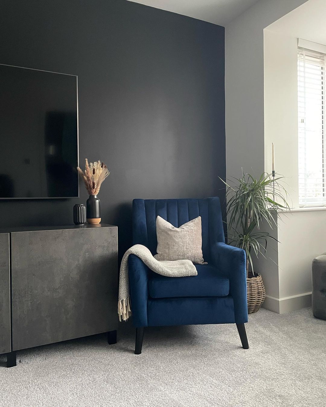
All the Colours of the Shade-bow
It can be easy to think of dark colours as drab, lumping them all into one category. But you have far, far more on your palette than you might think! Rich oxblood reds, soothing navies, warm dramatic browns, cool and collected greens… Even the choice between a charcoal grey, jet black or light slate can create different moods. Bright colours aren’t necessarily more diverse than deep ones! Get creative!
… And get inspired!
As always when making something new, it’s best to look at things that have come before. Here are a couple of examples from our fantastic Bloor community that utilise deep shades from the rich to the monochrome:
Be Bold
We hope we’ve opened your eyes to the world of possibilities hanging out in the deeper parts of the colour spectrum. Don’t be afraid of the dark! If you’d like to share your own obsidian experimentations with us on Instagram, make sure to tag us @BloorHomes!